Sketchnote a sermon on Elohim using the Banner Sketchnote Layout.

In our final study of Elohim, I thought we should sketchnote a sermon about Elohim. Tony Evan’s has written a devotional about and also gave a sermon on Elohim. I thought we could sketchnote the sermon using a layout I designed. You can find Dr. Evan’s sermon here on Youtube. I have provided you an image of my sketchnote above.
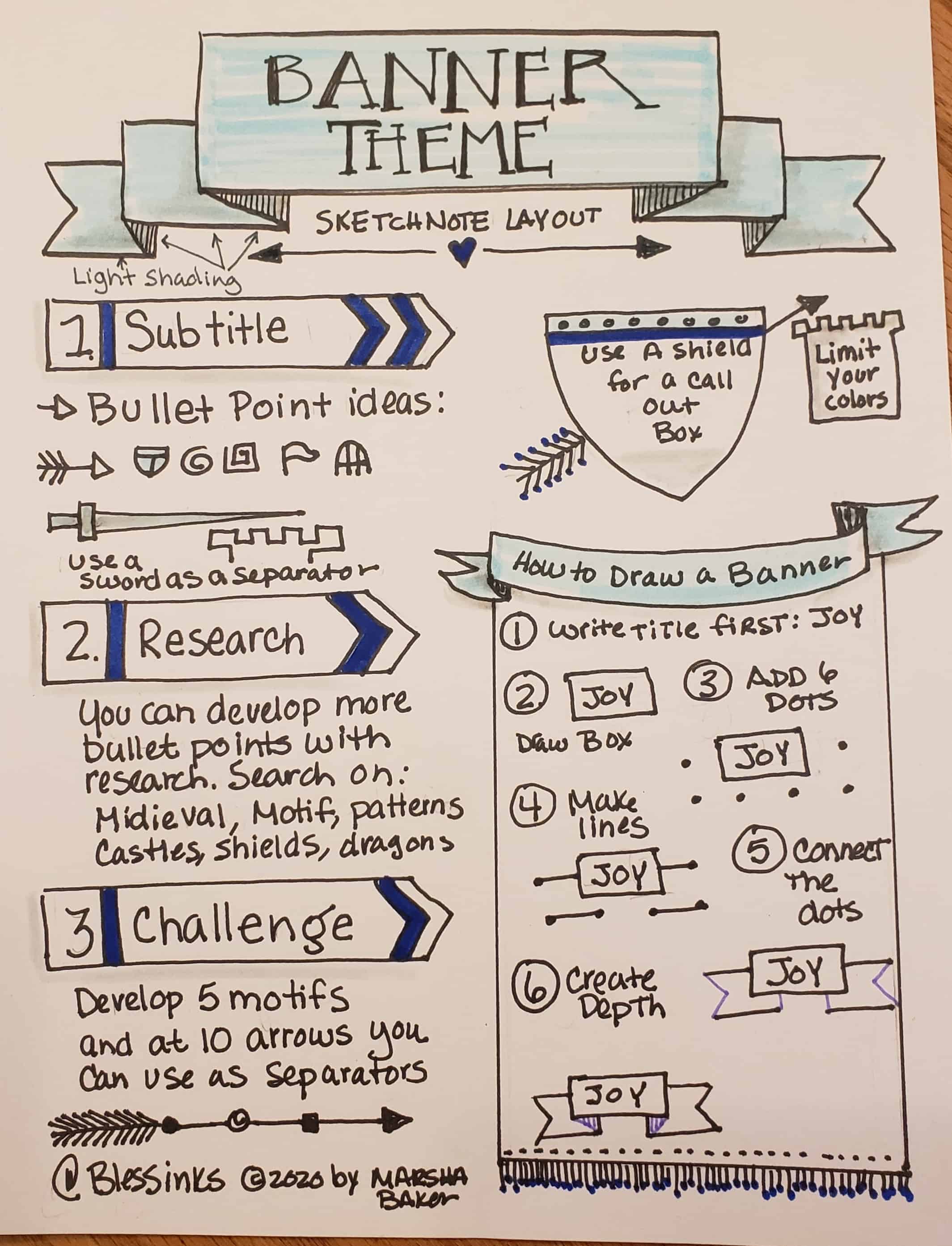
THE BANNER LAYOUT

The basic banner is easier to draw than you might think. Give it a try. You will find all kinds of places to draw this simple banner. Feel free to use a pencil and even a ruler in this process if you like.
- Write out your title first – inevitably if you don’t you will not have made the box large enough. Draw a rectangle around your title.
- Add three dots on either side of the box. See #2 above.
- Connect the dots with two parallel lines.
- Make “V”s to connect the bottom ribbons. Close the ribbon with a vertical line. see #4 above.
- Draw an angled line from the bottom corners of the large rectangle to the corners of the ribbons behind the big rectangle. Shade in this area to create depth.
Notice I did a double banner on the title of the layout page below. You can do as many layers as you like.
Banner Inspiration
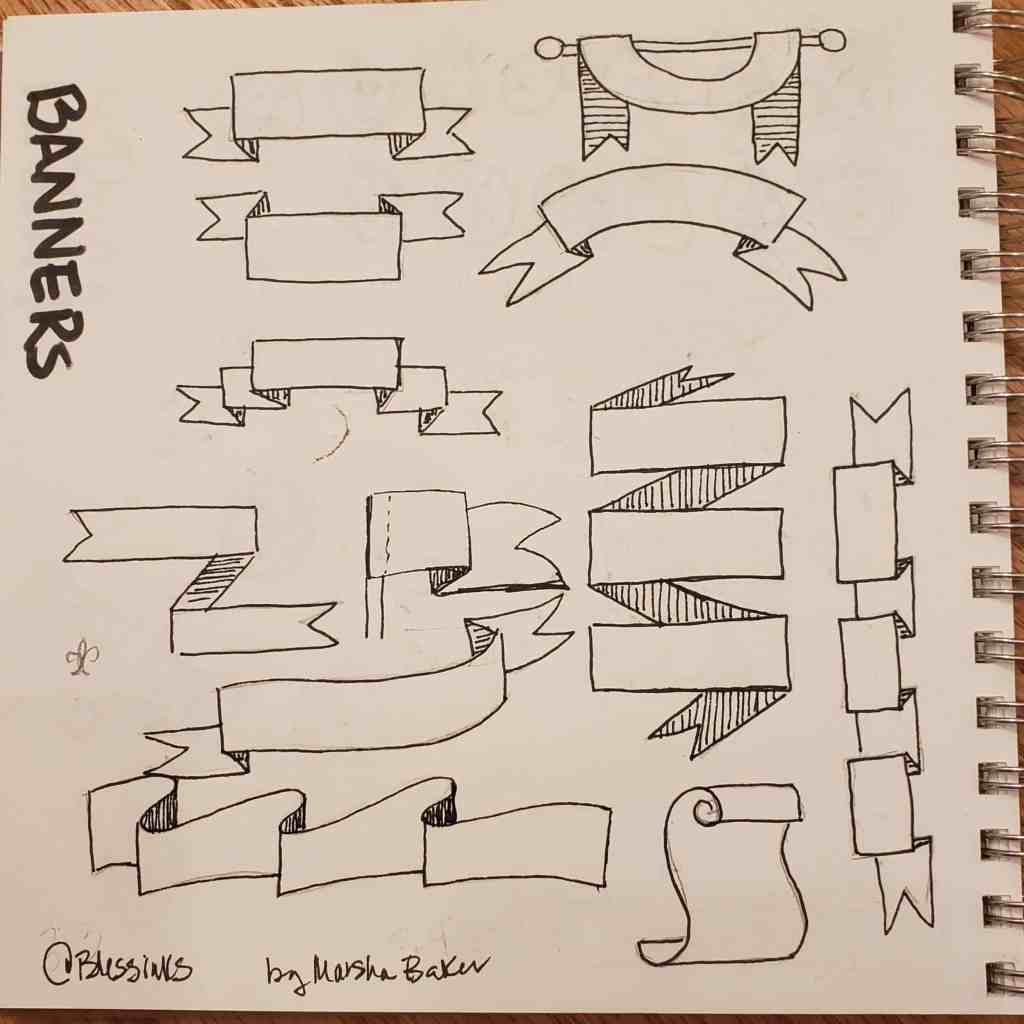
Here’s a page of my 100 Day of Icons Book that is all about Banners. I don’t think this even scratches the surface of all the variations of banners you can imagine.

The Sketchnote Banner Layout

I thought of castles and medieval times when I decided to draw a banner. Parties could also be another theme that works great with banners. I sat and brainstormed icons that could go along with my banner page. I came up with arrow,s swords, shields, castles and castle gate. You can use some elements of these items for bullet points or separators and connectors; the basic elements of sketchnoting.
When I do research on this topic I tried searching on Medieval motifs, medieval patterns, medieval icons, castles, King Arthur. I then clicked on images to see what came up. Just a word of warning there’s always trash out there so be careful with the image searches.
For the Elements of this layout, I used a modified banner of a long rectangle with a pointed end. I could use this for titles.
For callout boxes, I used the shape of a shield. Don’t forget to write first and then draw the image around your words.
I searched for a font that looked medieval and used it in the title of my Elohim Sketchnote. This was the first time I used this font so I could stand to practice it a bit more.
I then tried draping a banner over a pole to continue the look. Here’s a step by step guide on how to draw this draped banner.

Challenge
Your challenge this weekend is to use the banner in your Sermon Sketchnotes on Sunday or Sketchnote the Elohim Sermon by Tony Evans.
Elohim Series
For other posts in the Elohim Series click on the links below:

Leave a Reply