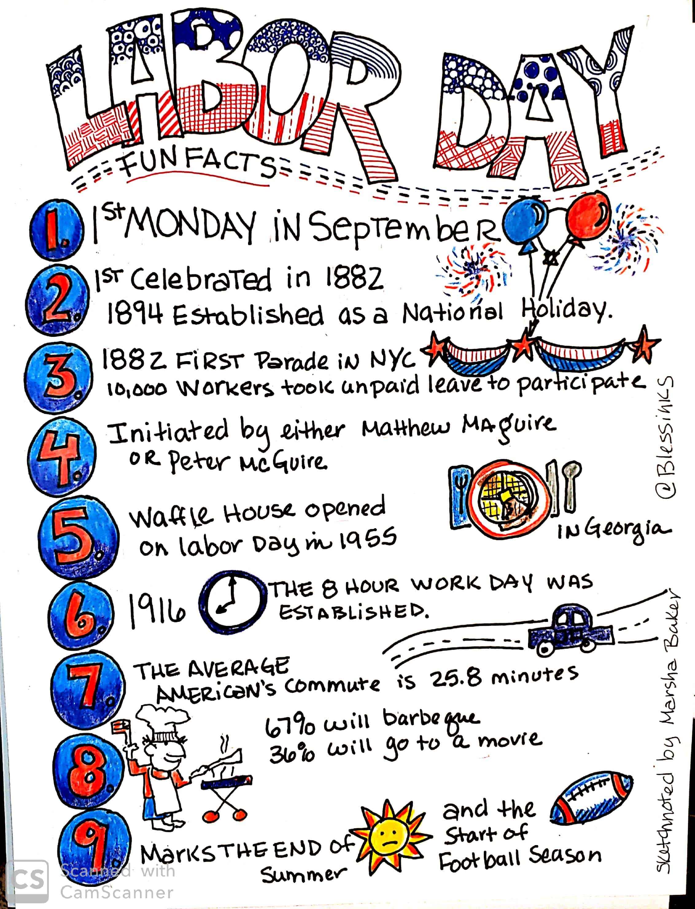
Happy Labor Day. I got up this morning and decided to post something in my online classroom to wish everyone a Happy Labor Day. I did some research and found some fun facts about Labor Day and then decided to put it all in a Sketchnote to post in my class. Hopefully, they will like it more than a lecture on Job Order Cost Accounting. I thought maybe I should share my process of creating a fact sheet.
Creating a Fact Sheet:
Then I decided this would make a great blog post and quick visual assignment. If you want to practice your visual literacy or visual skills, this could be a fun project and you’ll learn things that will stick with you. Here’ what to do:
- Pick a topic and then do a little research on that topic – keep it simple.
- Make a list of 10-12 interesting facts you gleaned during your reading.
- Create a Shortlist: Narrow down your list to 5-6 things.
- Think about how you can draw a few images for your shortlist. Not every item needs an image.
- Can you create some additional images – patterns, borders that will enhance your sketchnote?
- Start with the title, center it. If you’re just starting out, use block letters with very straight lines for your title. You can add interest by making the left side of the letter bolder by using a thicker line.
- Decide on a style of bullets or numbers. See image below for inspiration.
- Print out your points in block letters. It’s fine to use a pencil to map out your page.
- Decide where images or doodles are going to go on the page.
- Ink in your points
- Color: Choose a limited color palette, – a maximum of 3 colors
- Color your piece,
- Sign it, date it
- Publish it.
- Use #skectchnoteboss on Instagram to show us what Sketchnote BOSS you are!

Here are some finer points you might consider when doing your fact sheet:

TITLE:
If you’re just starting out, keep the title simple. Use block letters. Refer to the image above The first image just uses a fat marker making simple block letters, the second image uses a thin marker and makes two lines on the first part of the letter to add interest. The third image uses a border and raises the cross letters higher to create an interesting font. Notice that the title for the final piece has patterns in the letters instead of just coloring the letters with a solid color.

COLORS
I used blue and red ink pens on the title colored pencils on the numbers and images. If I had it to do over again I would have used the color pencils on the title as well to make it a little more cohesive.
NUMBERS:
I kept my numbers simple by drawing fat block letters and drawing a circle around them. To color them in, I colored the numbers in red-colored pencil and then colored the top of the circle in light blue colored pencil and the bottom of the circle in dark blue color pencil. I then colored the circle in the light blue again to blend the colors.
IMAGES:
#1,2,3 I combined all these points by demonstrating a celebration with a banner and balloons.
#5 I drew a simple place setting, to show a waffle,
#6 A clock is easy to show time
#8 I don’t draw people well, so I searched for a cartoon BBQ pic. I redrew it. I try to draw people even though I don’t like to as sketchnoting often lends itself
I’d love to see your Fact Sheet. Post it on Instagram with the hashtag: #sketchnoteboss.

Leave a Reply